AS-level Coursework Production Report & Evaluation example 1650~ words

This is a B grade piece of coursework, so it’s by no means perfect. If you’re studying a similar AQA syllabus, hopefully this example will give you ideas and show you how to improve. I hit the word limit and waffled too much about things that don’t matter (e.g. implying why I decided to use the English language for a tourism magazine). For reference, I’ve included the cover and content pages in this post.

Cover newest as.jpg
Yeah, could’ve been better. Awful coverline design. Only good thing on this page is the unique masthead design.
CONTENTS newest as.jpg
The contents page. It’s alright. Of course, you have to use original photos which is something I realised I lacked far too late into the project, so I used bland photos I took on holiday. Not a flattering image of a ‘world-class beach’.

Below is the essay I handed in. Tenses have been mixed up. You’ll want to use past-tense, not future-tense as I mistakenly did in the introductory paragraphs. Don’t bold certain words either – this was done to help myself recognise keywords. It just looks odd and copy-pasted (even though it wasn’t).

Concept

The magazine is based on tourism in Vancouver, Canada because I took some original photos taken there that would suit the magazine. The pre-production and production will make use of codes and conventions commonly found in all magazines, e.g. cover lines, masthead, images, etc.

This project incorporates:

  • One front cover
  • One contents page
  • A double paged feature article

Natural landscape scenery of Vancouver is used as these aspects have been known to attract tourists and holidaymakers to a new region, which is the aim of the magazine in this case. The magazine is both informative; providing essential information to tourists and residents as well as persuasive, through the use of attractive imagery taken around the city.

Design, Research & Evaluation

I researched tourism and other magazines in order to identify how audiences are gratified by the manipulation of a magazine’s conventions relative to its target audience. Ideas conceived from exemplar magazines are cited in this report.

Front Cover

Background: an image of a mountain in Vancouver is included to attract the attention of tourists –Burnaby Mountain in the outskirts of Vancouver. The use of a nature shot brings out scenery in Vancouver that tourists will be able to visit for themselves, as if the magazine serves as a preview of Vancouver for tourists, which is a selling point found in all travel magazines. For example; in The Travel Magazine, an article describes the Dubai Eye, the largest Ferris wheel in the world in order to inform the audience of what to expect if they were to visit it. The ‘Ainu’ totem-pole like sculptures featured in the image are iconic in Vancouver as it is known to be a symbol of commemoration to the good will of its relation to early Japanese inhabitants, thus making the photo relevant on the topic of tourism. The image gives a positive representation of Vancouver in its natural attractiveness; most of the colours are a shade of green and blue, denoting a clean environment – which is favourable. Many magazines use an element of the background to overlap some of the magazine title; this is seen in an issue of ‘Travel Leisure’, which used a spire which overlapped the masthead for an artistic effect. At first I thought this effect was not necessary but since there was plenty of space for more emphasis on the totems; I enlarged one with a bear on top and layered it on top of the URL.

The masthead is always important because it allows the audience to create a reference to the magazine and thus retain it in their memory. A title with a bright, eye-catching front has been used so that consumers can distinguish it from other magazines on a shelf. The title of the magazine is ‘Vancouver Today!’ which draws in audiences through direct language. This idea takes credit from other texts with the word ‘today’ as an appended adverb.[1] I used a large, white, handwritten font with a shadowed background and is easily interpreted by the audience that the magazine is up to date with current events, news and information. Unlike the colour black, white is usually associated with positive connotations such as purity. The title is embellished with an underlining which is stylised to fit the layout of the title as well as the white clouds in the background; ‘today’ is placed to the bottom-right of ‘Vancouver’. The line allows the convenient separation of a URL (‘VAToday.ca’) to the magazine’s website, giving the audience access to the website to gain more information about Vancouver which gratifies them in doing so.

A sort of lure is included at the bottom of the cover within a red strip, which contrasts with the soft colours above, thus drawing the audience’s attention to it. It elucidates the special ‘anniversary edition’ of the magazine, implying that the magazine contains more content about Vancouver than typical issues, enticing the audience to choose the magazine over others on a shelf as more content would likely bring greater gratification to the audience. From my research, this is seen in an issue of ‘Q’, a music magazine where a red strip is used to emphasise ‘all the month’s albums, gigs, films & DVDs reviewed and rated’.

Cover lines are used to emphasise the issue’s best content and are placed to the right side in order to keep the totem poles in the audience’s view. These cover lines take a white font similar to Arial with a black stroke to make it easy to read against the background. Direct mode of address is used to draw the audience into indulging in some of the articles, the most prominent examples are “your ultimate guide to Vancouver” and “all you need to know about hiking.” The image was also flipped so that the cover lines could be aligned to the right. Even though audiences read left to right, having the cover lines on the right cause the totems to stand out more, seizing greater attention. An example of when cover lines are aligned to one side for focus on the background is seen in some issues of Newsweek. A main cover line is utilised – “Can you take on the Grouse Grind Mountain?” This is in reference to hiking, as mountains surround the city. This signifies that the magazine contains content about the mountain and scaling it, the audience is also addressed directly.

Contents Page

The contents page features a blue-purple gradient strapline, containing the header ‘contents’ with the magazine name included in its signature font along with the issue date in order to fill space with useful information. A simplistic colour scheme is used so that the readers are able to gather the information without being deviated by too many technical codes, a common technique found in most magazines.

The page titles and references are in a columned layout so that the reader can gather as much information about each of the pages as possible. Each page reference utilises a colour code for the separation of different topics, making it easier for the reader to differentiate information. Most page references come with a first line and sub-line. The purpose of the first line to capture the readers’ attention with a bold font and the sub-line provides specific detail about the article. From my research, this has been seen in ‘Vogue’ and ‘Psychologies Magazine’. This structured layout makes the information easy to read.

There are four images on this page; all originally taken in Vancouver and are used for a varied representation of Vancouver; a beach, a city, transport and a modernistic building implant the idea in the readers’ minds that Vancouver is a diverse city with many different features. This therefore reflects the magazine; diverse content about Vancouver to satisfy the reader. However, one thing I would have liked to change is the use of nature shots to replace the image of ‘Vancouver’s horizon’, which would have given a further diverse representation of the city and would have been more visually pleasing – however a lack of original photography prevented this. Therefore; an overall image of grey city is weighted on more than greenery – an even dichotomy of the two would have been preferable, so this is a weakness.

Anchorage is used in the image of the beach. The image serves as a ‘hook’ whilst the overlaid text serves provides an anchor to the meaning, making Vancouver seem desirable.

Inner Pages

A double-page feature article is used for production. The layout is derived, but variant from the magazine Supply Management, a professional magazine with a clean presentation to present informative content. I feel this suits my magazine because it includes informative and persuasive language, i.e. informing readers about the ‘2020 Action Plan’. Purple is used in the colour scheme (heading, text) to mirror the colour code given in the contents page.

The below paragraph doesn’t make make much sense to me. Now that I’m in university, I have no idea what point I was trying to explain or how it benefits the evaluation.

Information from the ‘City of Vancouver’ website was researched to help create an informative article, but is not copied word-for-word in order to keep content original (and to avoid plagiarism). This article revolves around factual information regarding Vancouver’s 2020 Action Plan which aims to make the city as sustainable as possible. I feel this is a suitable article for the magazine because it is on the topic of one of the government’s top priority campaigns, therefore being a relevant subject to the readers who would purchase the magazine.

An image is used to represent the verdure in Vancouver; a high-angle long shot of the ‘Vancouver Conservatory’ in order to reflect the efforts to “a greener city” as described in the article.

The main strength of these pages is the eco-friendly representation of Vancouver. Many people are open to the idea of a clean, environmentally friendly city, so this helps build toward the aim of a positive representation of the city.

Target Audience

Travel and tourism magazines attract the attention of ABC1 social grade tourists as a primary audience.

^This is a reference to the NRS social grades. I remember wanting to say this, but if I did then my work would’ve gone above the 1650 upper word limit. The solution to this problem would have been to get rid of all the other unnecessary information that didn’t enrich the report, like plenty of obsolete information in the following paragraph below.

Demographics

  • Location: Vancouver, where the magazine is based
  • Age: 16 – 65, anyone younger or older is likely to have less interest in travel/tourism
  • All genders
  • Various ethnicities

The audience is likely to have little to no disability as well as having an employment because the magazine contains a large fraction of information about activities and places that require movement and travel expenses. Vancouver is located in British Columbia, Canada in which most people speak English. English is also the third most spoken language in the world[2], so it is theorised that most people who purchase this magazine will be able to read in English with the exception of some extraneous visitors. I anticipate that readers will originate from England, Japan and America as most visitors I have observed are from these places. The Japanese are also well-known for contributing to Vancouver’s industrial evolution up until a few decades ago, so a large fraction of visitors are likely to be relatives of the Japanese industrial workers. C2DE social classes are unlikely to purchase this magazine as tourism implies large travel expenses.

Psychographics

  • Activities/interests: Hiking, politics, travelling, tourism
  • Behaviour/attitudes: Literate, positive attitude to activity

This magazine is aimed at any audience with an interest for tourism in Vancouver; therefore the reader is not anticipated to have any particular values, ideologies or culture.

[1] Seen in India Today

[2] Retrieved from Nationalencyklopedin “Världens 100 största språk 2007” The World’s 100 Largest Languages in 2007
How does Fish Tank challenge typical representations of gender? (A-level homework piece) 800~ words

This is a so-and-so homework essay typed up using examples looked at during lessons. It’s no masterpiece of course because it was only done for homework. The Point, Example, Explain structure has clearly been overused. Another problem is the flow of consciousness, there’s no clear paragraph structure and ideas have been typed out as they came to mind. The writer clearly didn’t take this work seriously and even made a reference to Othello as a joke (which reading back on, wasn’t funny at all).

How does Fish Tank (2009) challenge typical representations of gender?

Representation is defined as re-presenting something in a particular way or as being of a certain nature. Media representations have been known to have a powerful influence on society’s ideologies and hegemonic values, they shape the way we think about issues, events and ideals among other things. Gender in the media has a variety of portrayals and attitudes to gender segregation have diminished over time, leaving less divide over male and female representations. However; gender stereotypes still exist and are used in the media industry mostly as a form of entertainment whereas countertypes are used for other purposes, predominantly as a device to attract audiences to the unusual convention as it deviates from the norm. Sometimes women are represented as sex objects to attract males or men as strong and charismatic, to attract females. In Fish Tank, the female director Andrea Arnold likely had a powerful influence on how gender was represented. Arnold’s films commonly explore female sexuality and Fish Tank is no exception, she excels in social realist dramas that are conventional in their working-class settings but her focus is refreshingly female. Accordingly; Arnold created Fish Tank with a mainly female perspective on an abused love relationship between a teenage girl and her mother’s older boyfriend.

Mia is in control of the narrative, being the protagonist we follow throughout the film she influences how the story pans out. She challenges female stereotypes by acting masculine, she is adventurous and overconfident, for example in the opening scene she is seen instigating violence amongst a group of girls dancing by head butting one of them in the face. Typically, young women as protagonists are seen as soft, caring and empathetic such as half of the characters in the television soap Eastenders and are only seen otherwise if they are antagonists such as the vampires in adventure film Van Helsing, making Mia a uniquely portrayed female antagonist. Mia is socially trapped and is used as an archetype for people who live in council estates. At one point when Connor is introduced, Mia is seen staring at Connor in relation to the female gaze theory. In a mid-shot; sunlight protruding from a window glistens against Connor’s body to sexualise him and to help the audience see from Mia’s perspective his attractiveness. Mia’s character is an undiscovered one in media and has a rare representation, although girls like her exist in real life, both in character and situation.

Connor is the first significant male character introduced and in the first half of the film, he is perceived as a hero. He is a father figure; good with children, polite and wealthy – almost the opposite of Mia who lives in poverty without a father. Like a Hollywood hero, Connor is an alpha male shown through his charismatic personality and almost depicts perfectness in a man. This sort of representation of a male early in the narrative leads the audience to believe he is the typical hero until certain scenes suggest he is taking advantage of Mia and her mother. As he is seen caring for Mia, the relationship between them becomes more palpable each time. For example; Connor earlier gives Mia a piggyback so she doesn’t have to walk on the cut on her ankle and then later, when he carries her to bed and takes off her trousers and tucks her in. Each of these scenes progressively become more intimate and is signified by the diegetic sound of intensified breathing this carries on until eventually the turning point is reached when Connor initiates intercourse with her. At this point, Connor is seen as a fiend who turned from hero to villain, sharing some similarity with Shakespeare’s play Othello. This goes against the norm that the wealthy, charismatic and handsome male remains heroic for the entire text, instead Connor uses these traits to take advantage of the family. It is unknown whether Connor had it planned from the beginning but it is likely since he already had a woman and child in his life.

Billy is first introduced as a minor character when Mia attempts to free a horse from captivity next to a caravan owned by a group of ‘pikeys’. In this scene, two of the boys abuse her, push her around, take her bag and carry her as if to perform a malignant act on her but she manages to escape. After a failed first attempt to free the horse, Mia turns up again and this time Billy confronts her. Unlike his brothers, Billy is sympathetic and more sensible, suggesting that the younger you are the more innocent you are. This gives evidence that there are certain overt characteristics that can be attributed to a character of either gender, in this case being empathy attributed to age rather than gender unlike in other media texts where empathy is typically associated with females.

A project of mine (YouTube Channel)

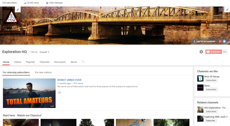
Here’s something I like to work on in my spare time and when I’m bored. It’s an urban exploration YouTube channel that a friend and I started in sixth form in 2014. Since then, we’ve made a few videos and you can see how they’ve improved over time. You have to start somewhere.

urbexers
Screenshot of the channel

Videos:

What do I use to edit these videos?

I use Adobe Premiere Pro CS6. Or if I’m using a university computer, I hop onto the CC version. I used to use Sony Vegas, but I ditched that because Adobe is generally accepted as the overlord of editing media content, and is also beheld as a more professional editing suite. If I really wanted to, I could use After Effects to create better visual effects, but these aren’t necessary for pseudo-documentary type of internet videos.

How much money went into this thing?

Not a lot actually. I already had an old camcorder called the Sony HDR-CX115E from a second-hand shop. I think it cost about £180 at the time. I’ve started using my phone instead; modern smartphones make very decent videos and it’s now even better than my old camcorder. We all chipped into the project by buying our own equipment. Torches, respirators, etc. As for the video editing software? You know how it is.

My advice

I actually used this channel in a university interview and I have to say; they were impressed. It seemed like I knew more about the program than ther interviewer did as well. Call me a bragger, but I couldn’t think of any other sixth form student who made videos as high quality as these. It showed that I was genuinely interested in the subject I wanted to do.

As for advice for doing this sort of thing yourself? Get motivated. If you don’t have any friends who would do this with you, do it yourself. You know the saying; “if you want something done, you’ve got to do it yourself.” Just watch other internet videos and copy them – but make them into your own creation. That’s what I did. Think of it as market research. You’d also want to hop on a good username for your stuff and grab it quick. We made the mistake of choosing the name Medway Urbex and then deciding we wanted to expand it outside of the Medway towns. We changed it a couple more times before we settled with Exploration HQ. We managed to change some of our URLs, but not all of them. Now we’re stuck with a YouTube channel that has “medwayurbex” and “ministryofexploration” as custom URLs but not “explorationhq” as with our facebook and twitter pages.

If you actually go ahead and make a YouTube thing (as well as if you already have), please don’t go putting in pop music in your videos. Use a royalty-free library. Back in the day, the selection of music in royalty-free libraries were so bland and common I didn’t bother using them. I tried mixing the tempo and pitch of good songs owned by copyright-holders to cheat the system, but now they’re being picked up on. Over the past few months, more and more of our old videos have been flagged up by the automatic Content ID system. Just go with royalty-free music; there’s many good sounding copyright clean music out there nowadays, so there’s no reason not to.

Engage with your community as well, social media is a thing to take hold of. Nowadays, you can’t have a YouTube channel you intend to spread without having the complementing Facebook and Twitter accounts.

Have fun with it while you can; once you move onto your next stage in life (e.g. university), you’ll find it difficult to find the time and place to do this stuff.

Oh, and…

  • Captioning your videos actually improves search engine optimisation (SEO)
  • Tag your videos with keywords people are likely to search for
  • Do not monetise your videos until they reach into the thousands (or better, tens of thousands). Seriously, it’s not worth it if you only get a few hundred views. The adverts will only drive new viewers away. Even we haven’t monetised anything yet
  • To achieve the effect we have on our newer intros, just layer upon layer of grunge textures on top of each other and change the blending options
  • One dirty tactic of getting your content to spread is by spamming twitter users with links. You know, those people who slide into your DMs after you follow back
  • Longer videos are preferred by the YouTube search algorithms. Try to make your videos 15~ minutes long. Our videos usually end up being about an hour long before editing, so it’s a lot of cutting but also a lot of leaving good stuff in
  • Try to come up with a unique concept. A reason for people to watch your stuff instead of “genericoolgamer1998”
  • Yes, this post is also intended to promote my channel

Links:

http://explorationhq.tumblr.com/

https://facebook.com/explorationhq

https://youtube.com/medwayurbex

How typical is Ill Manors of its genre? (A-level homework essay)

900~ word media studies essay on the film Ill Manors (2012).

How typical is Ill Manors of its genre?

We categorise media texts by looking at the repertoire of elements, which the audience utilise to label the many genres of film. If a character were to burst out in song in a moment of a film or play, the audience would immediately recognise it as being a musical. Ill Manors (Ben Drew) is mainly a crime drama with strong elements of social realism, signified by the strong use of drug references and violence, along with a realistic portrayal of contemporary life. Social realism is a popular genre for independent institutions to produce in the UK, with films such as Fish Tank and Wild Bill considered an art form being met with positive reception with particular praise for emotional satisfaction from its storytelling.

Each genre attracts its own groups of audiences who have a taste in certain genre conventions. Ill Manors contains gang violence and a strong fast-paces multi-stranded narrative which is likely to meet the tastes of teenagers. The ethnicity and age shown in the film are a mix of young teenagers and adults, Drew has used this target audience as the film is based upon the London riots which involved many young teenagers. The audience is also the same for Kidulthood as they are both similar in style. However, in terms of social realism, the film strays from the sort of audience who would watch Fish Tank as the way the films view contemporary life vary; Ill Manors is more crime oriented whereas Fish Tank focuses on gratifying the audience in diversion and dystopian pleasure in an arguably more serious approach. The audience for Fish Tank is male and female adults in the ABC1 social grades who are individualists. So in terms of audience, Ill Manors attracts a different audience to some films in the genre such as Fish Tank but retains some of the same audiences in films such as Kidulthood.

Crime dramas are often given urban settings to portray the gritty realism of crime and how it mostly occurs in densely populated areas. British crime dramas such as Kidulthood, Gangster #1 and This is England are all set in urban settlements, and more prominently, London is represented as a crime capital due to it being a densely populated city centre. Crime dramas are rarely set in the countryside as crimes are less plausible and may bore audiences, however in TV series, episodes are sometimes country-based as the non-progressive and transient episodes allow it to occur without permanence in other episodes. Ill Manors is set in the cityscape of London in similarity with crime dramas such as Luther, yet a minor difference is that one is a TV series which allows episode narratives to be transient and the other is a film with one overall narrative.

Black males have become associated with urban gang crimes, with youth typically wearing hoodies and baseball caps as seen in Ill Manors. These items of clothing create connotations of criminality and danger; on the DVD cover for example, a low angle shot of Aaron wearing exactly a hoodie and baseball cap holding a gun is used, so the cover clearly insinuates violence through an action code thus reinforcing stereotypical views of urban gang violence. However; instead of having an aggressive posture, his body language suggests anxiety and uncertainty, as if to imply that Aaron is not a typical aggressive criminal and that there is more than meets the eye. Kidulthood’s cover in comparison comprises of seven anti-social youths in direct mode of address, anti-social behaviour is implied through aggressive stances, with one flourishing a baseball bat. Similar to Ill Manors¸ a range of ethnicities is represented, however it is arguable that morals are in conflict as Kidulthood’s use of character signifies pure anti-social violence whereas Ill Manors has a sense of moral compass in that the character is looking away from the camera in contemplation. However, the way audiences perceive these representations is dependent upon their attitudes and values.

The narrative is non-linear and multi-stranded as we follow the stories of different characters at different points in time, a technique used to create enigma codes. For example, a major enigma code is when Jake is coaxed into killing someone in a house by Marcel. Time then rolls back to Kirby’s narrative and the enigma is solved when he is seen as the one who is shot by Jake in an act of vengeance by Marcel. For social realism films, this is atypical as they usually follow the narrative of one character and are linear. For example, Fish Tank and Wild Bill follow a single-stranded linear narrative which follows the story of the main characters, Mia and Bill. In Fish Tank, Mia is followed as a protagonist so that the audience receive a palpable sense of her emotions and moral values, as she learns more about the deception Connor had delved her into and takes decisions such as freeing a horse in captivity. Ill Manors arguably makes a greater utility of Syd Field’s three act structure, with the plot moving immediately to another plot point as the narratives occur at different times. Fish Tank has a less complex narrative structure which suits a primary audience of ABC1 middle class, male and female individualists and aspirers who are interested in British film.

In final analysis, I determine that Ill Manors strays little from other film crime dramas; it takes its setting in an urban cityscape and contains similarities to films such as Kidulthood and 1 Day yet differs more from social realism films such as Fish Tank and Wild Bill. In comparison with TV series, Ill Manors contains little sense of law being triumphant as in most series such as Luther and Sherlock; we see the narrative in the perspective of the law enforcement.

A2 Media Studies Coursework Essay example

Below are my production pieces for reference.

asteria-current-cover
My DVD cover, “Dobby Digital” heh

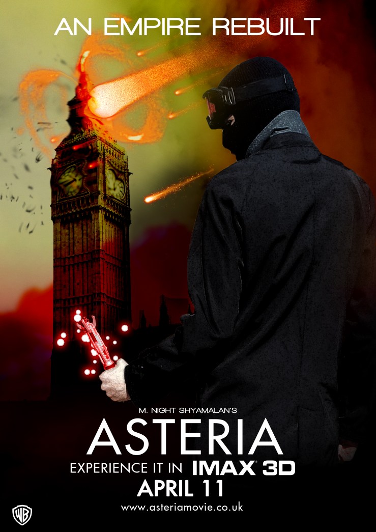
asteria poster 3.jpg
Poster 1, all original photos and work except for the WB logo.

The second poster I made is too embarrassing to share, so I’ll leave that one to your imagination.

This was done with a 2014 AQA specification. So it is out of date, but hopefully still helpful if you’re looking for ideas on what to type about. My choice was to produce a DVD cover along with two posters, and below is the essay which I handed in with it. It scored me a 98%. Remember to include a bibliography, otherwise it’s plagiarism. This essay is actually almost on par with my degree-level essays.

How and why is genre constructed in DVD covers of science fiction/adventure films, with reference to Dredd (2012) and Star Wars Episode III (2005)

Genre refers to the set of recognisable conventions which label all media texts; we categorise texts by looking at the repertoire of elements, which the audience utilise to label the many genres of film. Most theorists of genre argue that generic norms and conventions are recognised and shared by audiences, readers and viewers.[1] Sobchack suggests that “science fiction film is a genre which emphasises actual, extrapolative, or speculative science and the empirical method, interacting in a social context with the lesser emphasised, but still present, transcendentalism of magic and religion, in an attempt to reconcile man with the unknown”[2]. Sobchack lists science fiction and adventure as main genres of melodrama, which explains why science-fiction and adventure are commonly hybridised to appeal to a wide audience segment that has an interest in both of these well regarded genres. This is for example reflected in the main cover image of the Star Wars III cover, where the audience are shown sci-fi elements such as ‘light sabres’ in conjunction with action codes in the depicted battles. Dredd (Pete Travis) and Star Wars Episode III (George Lucas) are modern works in the genre and the covers conform to generic convention.

Firstly, science fiction can be said to originate from Ancient Greece wherein myths about Gods and space cultivated beliefs in its historic society’s religion; these have arguably formed a basis for modern science fiction narratives such as Star Wars, seen by the depiction of stars and space on the front cover. The current post-modern hybridisation of the science-fiction and action genres are highly influenced by popular pioneering films such as the space opera Star Wars and continues to draw in large audiences from all over the world. The saga fundamentally changed the aesthetics and narratives of Hollywood films, switching the focus of Hollywood-made films from deep, meaningful stories based on dramatic conflict, themes and irony to sprawling special-effects-laden blockbusters.[3] Since its introduction, the genre has been associated with unique and iconic depictions of the universe, humanoid extraterrestrial life forms and futuristic technology as seen in both DVD covers, i.e. the use of futuristic costumes and the light sabres. These selling points are some of the main reasons why producers enter the science fiction genre; sophisticated software allows them to offer unusual and interesting concepts for audience gratification.

With regard to how genre is constructed in the covers, Fiske describes communication as “the production and exchange of meanings. It is concerned with how messages, or texts, interact with people in order to produce meanings”.[4] Expectations of science-fiction are created through the strong depiction of advanced technology, space travel and similar conventions.  Audience decoding of the covers would immediately suggest the science fiction genre from the CGI use in creating the surreal imagery of futuristic technology. As the mise-en-scènes suggest, the genre attempts to transform the unreal into an exaggerated aural spectacle, and is seen in the portrayal of space in Star Wars and the ‘mega city’ in Dredd. Typical central cover images of this genre entail a shot of the protagonist(s) along with science-fiction elements such as weaponry, e.g. ‘light sabres’ in Star Wars to connote the combined sci-fi and action elements the films contain. Furthermore, a low-angle shot of the protagonist is chosen to convey the power of the hero such as in Dredd; the effect is that the character looks big, dominant and awe-inducing. The DVD cover aims to reach its target audience and does so by selecting elements of the genre and representing these elements in the cover image to appeal to those it seeks to gratify. The genre itself already sells to the audience, however producers use genre conventions to raise audience expectations; CGI, for example, is used to create conventional symbols of science fiction and is seen in both texts; e.g. the light sabres in Star Wars and the ‘mega blocks’ in Dredd. Gratification is likely to occur in aesthetic enjoyment, diversion and escapism as both texts offer an alternative narrative.

In addition, the characters’ attributes in each cover vary, yet all give an impression of both the science fiction and adventure genre. DVD covers of all genres typically portray the protagonist(s) or, according to Propp’s character types; the hero. Some institutions use more than one character, as seen in Star Wars where Anakin and Obi-Wan are the heroes, Padmé the princess, Vader the villain etc.[5] The costumes construct ideas about each character and suggest an alternative reality, a literary device used in most, if not all science-fiction films. Darth Vader, for example is wearing an all-black mechanical costume, connoting his diabolical and villainous character traits. In comparison with Dredd, only the hero is used for the main image and is holding a weapon, preceding its action and adventure elements as well as portraying Dredd as a powerful character. Actions codes are created through the use of weapons and the protagonist’s clenched fist, contributing to the hybridisation of action and science fiction. Since only Dredd’s lower face is visible, the audience expects him to be a cold and isolated character, expectations of which are gratified when viewing the film because his character reflects the expectation made through the cover. Each character therefore contributes to the construction of action, adventure and science fiction genres; producers utilise character creation so that audience view the preferred reading of the genre.

Binary oppositions are made clear in both main images; in Star Wars, the contrast between hero and villain reinforces genre conventions; it appears that many science fiction films have heroes and villains, and is constructed through facial expression, costume and makeup and is shown because of its strong implications in the narrative of the saga. In Dredd, the tagline is “judgement is coming” and fans familiar with the character would recognise that the main character is Judge Dredd, implying the desire to keep order and peace since a low-angle shot makes him look like a dominant overseer, thus being the hero. This contrasts with his background, in which a relation to the action/adventure genre can be identified in the insinuation of chaos and disorder, which the ‘judge’ sets out to restore equilibrium to.

As romantic sub-plots are common in the adventure genre, Star Wars suggests a love relationship in its cover through the portrayal of a hero and a princess (the hero’s prize according to Propp), however there is no suggestion in Dredd, no female characters are included in the cover at all. Dredd could be considered atypical of the genre due to its lack of amative representation, as many classic action/adventure films have some form of romance in them, e.g. Indiana Jones, Planet of The Apes and James Bond. Instead, Dredd’s character is deindividuated to remain true to the original comics, thus gratifying the needs of the character’s original fandom over the average audience wants. The hybridisation of adventure and romance is very common; Star Wars acclimatises to this trend to appeal to an audience of males and females since males are attracted by the action and females are typically attracted to romance, whereas a lack of love interest in Dredd may indicate a narrative which predominantly appeals to males. In narrative, love interest both hinders and supports the main quest, so a lack of romance may indicate a more action-based narrative in Dredd which appeals to males.

The blurbs of both films give a sense of lore and history to the narratives, since a common convention of science fiction is that the setting takes place in an alternative universe to ours. Star Wars utilises its own semantic field in conveying lore; “Anakin Skywalker has become a headstrong Jedi Knight and a hero of the Clone Wars”, the preferred reading is that the reader decodes ‘Jedi Knight’ as a sort of keeper of peace due to the connotation of ‘knight’ and that the ‘Clone Wars’ is an event of conflict in the narrative of the saga. Dredd on the other hand refrains from using unfamiliar terminology and simply tells the story of “America of the post-apocalyptic future”, likely to balance the appeal to fans of the original by use of the familiar front image, reminiscent of the comic books, and general audiences using the simple literary semiotics of the blurb. This is reversed on the Star Wars cover, wherein a general audience is attracted from the simple representations of the protagonists and antagonists on front cover yet fans are informed through the blurb. Genre is therefore implied through the blurbs of the covers to illustrate the special worlds, further attracting audiences of the genre in conjunction with the use of graphics. These are not realistic films, although the characters must be believable; the audiences must recognise the inclusion of melodrama rather than hollow characters otherwise an aberrant reading may occur. On the same subject, the main titles, including the masthead and spine title of each cover contributes to the genre of both texts. The spine titles are in block capital fonts in parallel with each other, with Dredd’s being in a bold red colour to characterise the violence and graphic nature of the film – red is commonly associated with blood, danger and violence; therefore being a metonym for the graphic nature of the film.

With large filming budgets of $50,000,000 (Dredd) and $113,000,000 (Star Wars Episode III); both production companies and publishers alike want to express the visual aesthetics of the genre as much as possible through advertising, with DVD covers being one of the mediums available for producers to communicate to the audience. Dredd is set in a stereotypical world of the future; shown through the depiction of a dystopic, futuristic yet familiar world. Conversely, Star Wars is set in a distant past “in a galaxy far, far away” yet gives a sense of the futuristic space age. The combination of narrative in the blurbs and imagery used both give a sense of science fiction, I.E. “a vast, ultraviolent world where criminals control the mean city streets” as part of the blurb combined with burning city buildings in the background illustrate the connection.

Ultimately, these texts can be used to trace a pattern of the construction of the science fiction genre in modern works in the film industry. Concerning an entirely surreal universe, Lucas focuses on straightforward CGI phantasmagoria and a holistic portrayal of all major characters. But in Dredd, appealing to common audiences becomes less important due to the current fandom of Judge Dredd; Travis instead focuses on retaining an audience consisting of the fandom of the original Judge Dredd comic character, arguably to distinguish the film from others in the genre. Lucas Arts wants to appeal to the large audience segment of audiences who seek general aesthetic enjoyment, and Lionsgate wants to secure the audience segment of original fans before a universal audience. Yet principally, both texts portray the classic codes and conventions of science fiction. Genre conventions are used to achieve a product which markets itself to audience segments with taste for the science fiction genre, and is clearly seen here.

Bibliography

Bigsby, C. (2006). The Cambridge Companion to Modern American Culture. Cambridge University Press.

Bleiler, E. F. (1990). Science-fiction, the Early Years: A Full Description of More Than 3,000 Science-fiction Stories from Earliest Times to the Appearance of the Genre Magazines in 1930 with Author, Title, and Motif Indexes. Kent State University Press.

Chandler, D. (2000). An Introduction to Genre Theory.

Creeber, G. (2001). What is Genre? In The Television Genre Book. British Film Institute.

Fiske, J. (1990). Introduction to Communication Studies. Routledge.

Propp, V. (1968). Morphology of the Folk Tale. University of Texas Press, 2nd edition.

Sobchack, & Sobchack. (1980). The Limits of Infinity: The American Science Fiction Film 1950-1975. New York: A S Barnes.

[1] Creeber, G. (2001). What is Genre? In The Television Genre Book. British Film Institute. P.1

[2] Sobchack & Sobchack (1980). The Limits of Infinity: The American Science Fiction Film 1950-1975 203-40

[3] Bigsby, C. (2006). The Cambridge Companion to Modern American Culture. Cambridge University Press.

[4] Fiske, J. (1990). Introduction to Communication Studies. Routledge.

[5] Propp, V. (1968). Morphology of the Folk Tale. University of Texas Press, 2nd edition.

Using detailed examples, explain representations of masculinity – AS Level essay


This is a so-and-so homework essay done using examples looked at during lessons. Some major let-downs are that it doesn’t have an introductory paragraph, connectives, or a good conclusion. Other than that, the body is rather spot-on for a homework piece.

Male stereotypes such as men being heroes and strong are seen in media such as Die Hard 4.0 and The Expendables through the use of actors with muscular bodies, revealing glistening physiques and low-angle shots. Countertypes are also present in the media, for example; stayathomedads.co.uk and some news articles address role-reversals in the stereotypical husband and wife relationships. Advertisements aimed at men often use stereotypical images to be able to relate to the target audience; the Dove moving image advert during the American Super Bowl uses this convention. Among these representations, there are indications of drug use by males in films like Shifty. There are also subtly displayed stereotypes in some of these materials such as men being gamers, lovers and leaders.

In film; a stereotype commonly seen is the representation that men are brave, strong and protectors; ‘The Action Hero’ stereotype. This common stereotype is represented in Die Hard 4.0, The Expendables and Skyfall. Representations of this stereotype are expressed through medium close-ups and low-angled shots which show the strength and power of the male characters. In terms of character; costumes are usually war-torn with facial expressions depicting aggressiveness, which are connotations of fighting/violence – this is mostly seen in The Expendables. Another technique to show strength is used in oiling the actors’ muscles and the light source from fire and explosions cause their bodies to glisten, putting emphasis on their strength. The title of Die Hard itself connotes the determination to win, or die in attempt. In Skyfall, the main protagonist is seen holding a gun in one of the opening shots, which is an action code that signifies that there will be action in the film. The protagonist also gets a reward in the form of a girl, which is stereotypical of male heroes. Skyfall represents ‘The Strong Silent Type’ stereotype, with the character being in control and succeeding with women. These stereotypes are reinforced with calmness of characters and the skilled use of weapons.

In an English urban thriller, Shifty portrays the main male protagonists in in varied ways from typical action/adventure films. The scene is set in a council estate in London, as such; all characters are designed to suit the environment. In terms of male representation, all of the males portrayed in the film appear to have something to do with drugs. Because of its dark nature, the film’s lighting is low-key for most parts. It also incorporates cultural identities and the fact that ‘Shifty’ has 4 A-levels but still deals with drugs rather than having a real job – from these plot devices, a complex representation is drawn which consists of various interpretations, such as men being aggressive, submissive and professional at their occupation. ‘Trevor’ is shown to have control in his family through having demands in choices that affect his family. Trevor is not a stereotypical drug user since he has a reasonably nice house and family, whereas Shifty and Chris are more stereotypical ‘lads’ – they use colloquial language, repeated use of cursing and going around carrying out deals. These social realism techniques make the entire representation seem real; as such we receive more complexly constructed representations.

Advertisements aimed at men often use stereotypical images to relate the good/service to the target audience. An example of an advertising campaign that uses this scheme is the Dove USA Super Bowl XLIV ad for grooming products for men. The advert was shown during the event because middle-aged American men are the primary audience for the sport. It made use of a chronological stereotypical American male’s life in a montage of shots in sync with a man’s voice singing a narrative to the tune of ‘William Tell Overture’, which consists of activities which men would stereotypically do throughout their lives, such as getting married and “(having) three kids”. Each stereotype is visually shown, such as a boy playing with some masculine toys and riding a bicycle. This is an example of anchorage; the narration leads to an open range of interpretations. The main perspective the audience should receive is the representation of stereotypical things men would do in their lifetime. The montage of different scenarios serve as ‘hooks’ while the narration through song provides an anchor to the meaning.

In the music industry, there are vast representations of male stereotypes. One Direction is a ‘boy band’ with a target audience of teenage females. On their website, the colour scheme makes use of soft colour shades such as light green and sky blue – these soft colours suggest femininity, which suits the target audience. The font and use of symbols such as stars and hearts make the page look like a girls’ scrapbook, which helps relate the band to the target audience. A contrasting representation to this is the Dizzee Rascal website.         On this page, the colour used is mainly black and white – these two colours connote simplicity and perhaps even the artist’s ethnic origin, which is clearly presented on the page. His serious expression shows dedication to his occupation. These conventions show that his songs are aimed at males rather than teenage females.

A representation that most industries refrain from using is of the metrosexual male; a man who is in touch with his feminine side who has male qualities but also takes pride in appearance. This representation was used in a perfume advert for ‘1 Million by Paco Rabanne’. The actor used is not a stereotypical strong, manly character but instead; he is clean cut and slim with contrasting formal attire which is shown in each of his shots, showing he cares about his appearance. He wears a feminine belt and each pose he strikes resembles one that a female would do – however, when he clicks and a girl’s dress falls off, his heterosexuality is signified. A groovy, rebellious lifestyle is indicated with each click; whenever the actor clicks, a quick fix is shown for cars, gambling and women which could represent the wants of men. So as with the Dove advert, the institute uses scenarios to relate with the target audience of men.

A countertype in the media representing masculinity is househusbands. Daily Mail news articles address that househusbands are becoming increasingly common. The online news article has images which portray closer relationships between a father and child. The first image on the page is constructed for the article and depicts a man with a baby in a doorway with a woman in the background in office clothes, presumably going to work. This image shows the role-reversal in the relationship where the wife provides income for the family and the husband stays at home, looking after their child to match the context of the article. The shot is medium-long and is focused on the man and child in the foreground in order to bring attention that the husband will be staying at home with his child so that the audience is shocked with what is first perceived, because it is against the norm. This challenges the stereotype that society widely accepts. A second image is used and uses the same aesthetics. Older generation audiences are likely to have an oppositional reading to this countertype because in their generation, it was idealistic for the women to stay at home while the husband provided an income for the family to thrive on. There are lots of audience viewpoints and responses based on how they were brought up on this idea.

It is apparent that stereotypes are used by the media to appeal to a certain audience, such as adverts using stereotypical images to appeal to men who are familiar with the stereotypes and can therefore relate with the imagery. However; along with stereotypical representations, oppositional readings can be made by certain audiences such as the older generation with ‘househusbands’.

Media-centred Personal Statement example

This is a personal statement I typed up with a degree in media in mind. I specified that I hadn’t done any work experience because I hadn’t. My awful school (third worst school in the country for GCSE results at the time) cocked up my chance at getting work experience, so my dad decided to take me to work with him. If you have work experience, include it.

Here’s a guide to help: https://www.essex.ac.uk/outreach/documents/personal-statement-writing-guide.pdf

I have a strong interest in image and video production; it drives my enthusiasm to have an opportunity to use my talents in prominent media products, which shape society’s ideologies. My initial attraction to media transpired when I made sketches with my friends and recorded them using a phone, since then, media production has intrigued me both as a subject and profession; as a result I have taken media studies as a subject for both GCSE and A-level courses and achieved good grades. My next step is to take a degree in the field from which I can achieve my ambition to work in the media industry; it could be as a designer, producer or cameraman. Any of these career paths will satisfy my goal and I will be able to put my skills to good use.

I have good knowledge of media production computer programmes because I have often used Adobe Premiere Pro CS6 and Sony Vegas to edit original videos for the entertainment of others online through the use of the video streaming service YouTube. I have been teaching myself how to use Photoshop to create original images and have done so for recreation and for the request of others. For example, I created a wallpaper for a business my classmates started in the beginning of year 12. In my studies last year, I produced an A grade piece of coursework for media studies in the production of a magazine. I feel universities would benefit from having me on the course because of my commitment to each piece of work I produce.

In February 2010 I was fortunate enough to undertake relevant work experience (although uncertified) in a media department of the Ministry of Defence (MOD) offices in London. I was mainly taught about laws concerning the distribution of media such as photos and videos and how it is leased to other businesses. I learned how the MOD distributes its photos through a private web service to businesses such as museums and the news industry and how certain images are restricted from distribution. I found this sort of work exciting and it could be potentially used to prevent crime since special measures are put in place to prevent identity theft, fraud and copyright infringements.

I chose my A-levels because Psychology and English Literature are entwined with Media Studies. Psychology is useful in marketing, wherein a marketer must get into the minds of the audience to promote a product or service to that specific audience. English Literature is a convention of all English media texts – it is the baseline of what audiences read in books, magazines, newspapers and other media texts. In my final school year I took the opportunity to volunteer as a light and sound technician at Medway Little Theatre, a relevant interest that has helped accustom me to the technical side of media production beyond the school curriculum.

I have undertaken a youth development programme called the National Citizen Service (NCS) which has let me develop and utilise teamwork and communication skills; NCS involves a three-day group residential trip to PGL, East Sussex followed by a social action project in my local area. This social action project was a campaign for my local community, which aimed to positively promote multiculturalism; I was given the responsibility to create a survey needed by team members to interview the public with, along with printing digital copies of our plans to hand out to the team. I see this course as essential in preparation for university as each person is collectively put in control of the outcome of the campaign.

With enthusiasm about working in the media industry in the future, I am determined to make the most of my degree to achieve my ambitions.

GCSE Level Analysis of Alfred Hitchcock’s Rear Window Opening

GCSE Level Analysis of the Rear Window (Alfred Hitchcock) Opening Sequence.

This was done for a media studies GCSE essay, it scored top marks in the class at the time and landed me an A*. Although now that I’m at university and looking back at it, it’s a very shoddy piece of work. Of course; at GCSE level this sort of Point, Example, Explain (or however way it goes) work is expected. All they want you to do is explain shot types, denotations, connotations, hidden meanings, plot devices, audience reactions, and so on. Just read up on your AOs (Assessment Objectives) if they still even exist, and work with those in mind and it’s an easy A*.

I’ve just noticed that I missed out on relevant character and narrative theory. I didn’t even mention the word ‘protagonist’ or ‘equilibrium’ once, ala Vladimir Propp and Tzvetan Todorov.

In the opening sequence of Rear Window (1954), Alfred Hitchcock uses a variety of narratives, symbolism and originality to encourage the audience to continue watching. With a combination of visual techniques and subtle symbolism such as the black cat, Hitchcock encourages the audience to continue watching the film to find out what happens next. The genre of the film is thriller. The lighting is low-key which is typical for a film of this genre, though the technology at the time the film was made may have severely limited the ability to change the contrast and brightness through editing. The mise-en-scène is slow paced, and reveals information that is important throughout the entire film, especially the fact that it’s hot and there’s a lack of privacy because of it; key information for the film’s narrative.

In the opening, the soundtrack is lively, with jazz instruments, such as a saxophone. This genre of music was popular at the time the film was made. Along with the introduction credits, the camera is slowly zooming into progressively opening blinds, opening one by one. This can be similarly perceived as curtains rising to set the scene at the beginning of a play in a theatre. The text isn’t a boring generic font, but instead has an artistic style to draw the audience’s attention. The room slowly becomes brighter, giving the audience the idea that it is the start of the day. It is possible that the shot was intended to give the feeling it was a time-lapse of night turning to day. The soundtrack strikes up when Alfred Hitchcock is credited, which emphasises his important role to the audience. After this, the soundtrack is calmer, which helps to turn the audience’s attention to visuals. The windows are open; this signifies that it’s hot. The shot of the apartments brings the audience a sense of security, with a seemingly pleasant neighbourhood and a fine morning, a contrast to later events in the film.

After this, the shot switches to a high-angle shot of the ground below. An unheeded black cat is seen walking up some stairs. Black cats are known to be symbolic for misfortune, which fits the plot of the film. The camera tracks the cat upwards, and pans up to the apartments opposite. The camera halts at the ladder leading to the upper part of the apartment building and tilts slowly upwards, following the ladder. It is as if it is following someone climbing the ladder; it climbs all the way to the upper apartment balcony where a father, mother and daughter are preparing for the day. All the windows seen are open with no blinds or curtains blocking the view. This shows that there is very little privacy and that anyone such as Jeffries can see what is happening through the windows. If it wasn’t for this circumstance, the plot of the film would not be possible.

After the panning, a woman is seen with only undergarments on in a small apartment. She does some stretches – the audience is led to believe that she’s a dancer, which comes in later. Then, the camera switches to a shot of another larger and more open apartment. This is the home of a musician; through the window he’s seen shaving and listening to the radio, which reinforces the idea that it’s the beginning of the day. The audience can tell he is a musician because of the piano that is placed where it can clearly be seen. He turns off the radio after listening to an advert upon hearing “are you over 40 and feeling run down?” This tells the audience that the character doesn’t want to be reminded that he’s old. The introductions of these two characters show how life is in the city. It informs the audience about the hierarchy of the working class people and the contrasts between their standards of living – we know this because the musician has a larger, spacious apartment and the dancer has a small apartment. They are also connected because a musician creates music and dancers dance to music, a small detail some audience members probably would not have picked up on. After this, the camera pans to the other apartments and a medium-long shot of a couple are seen waking up on the balcony of their apartment, this indicates the heat, which is important for the plot of the film. A dog is seen with a leash tied to a lamppost and there is diegetic sound of traffic and children. This gives the audience the feel of the city environment. It’s important to emphasise the urban setting because the audience is shown that it’s hard to commit a crime going unnoticed. But somehow, Thorwald is able to commit murder and dispose a body in the city through careful planning. Nobody but Jeffries catches onto his plan. The camera then cuts to an extreme close-up of a thermometer, which reads as 94 degrees Fahrenheit. Hitchcock is emphasising and reinforcing the idea that the temperature is hot to the audience because it plays an important role throughout the film. The view of the apartments is a direct reference to one’s point of view through voyeurism from a vantage point – in this case being a rear apartment window.

After this, we have a close-up shot of L.B. Jeffries (played by James Stewart). He is in a wheelchair, wearing a blue shirt and with a sweaty face, by now the audience should understand that it is a very hot day. The colour blue is often associated with a cold temperature, which contrasts with the surrounding red and orange colours which represents the heat around him. Blue collars also associate with the working classes. Metaphysical teachers of the Ancient East taught that the colour blue is tied to the throat, or anything to do with verbalisation. In Jeffries’ case, it seems that because he is in a wheelchair, no one will listen to his shouts for help, which comes in later in the film. The camera then continues to pan over to his leg, where the audience sees “here lies the broken bones of L.B. Jeffries”. This shows that although he may be regarded as an uptight person from first impression due to his serious and strict looking expression, he has a sense of humour. The camera then continues to pan and track to a smashed up camera. Hitchcock shows this to help the audience understand his profession and how his leg was broken, which was when he was taking photographs. This shows how much of a risk taker he is, which is very important to the narrative. The camera continues tracking and we see a shot of framed photos of cars on the wall. The first picture is of a tire that appears to be on course to hitting the camera. This leads the audience to think that he is a car enthusiast (but he’s not necessarily) and that his leg was broken in a car accident due to the nature of the photos. The camera continues along a table and shows a photo-negative framed picture of a woman. After this, the camera pans onto a magazine. The front cover of the magazine appears to be the same woman in the framed photo. This tells the audience that he may be close to this woman, who is later revealed to be Lisa, his girlfriend, and that she is successful and may come into the story at a later time. Jeffries believes that Lisa is not the type of person that takes risks. This is later proved wrong later in the film. Lisa has a major significance later in the story because she is the one able to bring Thorwald to justice. This contrasts to what Jeff perceives her as at the beginning.

Jeffries then receives a phone call after waking up. When answered, we see a mid-shot of Jeffries on the phone. Important details of ‘Jeff’ are revealed in the conversation. It is revealed that he’s bored, he wants to get out of the cast, wants his assignments and he is important. Because he is bored, this leads on to his voyeurism, which then leads on to his suspicion of murder. Jeffries accuses him of stealing his assignments. He eagerly wants to get out of his cast and take his assignments but the person on the other end doesn’t want him to because he is too precious, he’s at the top of his job and valuable, so they don’t want to risk him being injured further. In the phone call, it is also revealed that he was the photographer that took the photos of the car before he broke his leg. With this, the audience is now ensured that this with the evidence of the pictures seen and broken camera, that this was the cause of his broken leg and that he is a risk taker. Jeffries mentions that he doesn’t want to commit to get married due to his beliefs about Lisa.  During the conversation, we see a point-of-view (first person) shot of a couple in the apartments opposite through Jeffries’ rear window. The woman is lying in bed with the man standing. This indicates that she may be poorly. This is meaningful because later in the film when Lisa is revealed, she cares for Jeffries while with the other couple, the opposite thing is happening. The man, later revealed as Thorwald, doesn’t care for his wife when she is poorly, but instead murders her whilst Jeffries is poorly and Lisa cares for him. This shows that in one relationship, there is love, and in the other, there is not.  Another reason this specific scene is meaningful is because when we see the shot of the couple, Jeffries is having a conversation about marriage and how he doesn’t want to commit.

While Jeffries is on the phone, we get another point-of-view shot of two women removing all their clothes and bathe with each other, which is not visible to the audience. This hints at Jeffries’ voyeurism. Then, there’s a shot of a helicopter flying lower and lower. This is an example of the use of special effects. The audience can hear the sound effect of the helicopter, which gives the feel of the helicopter actually being there. It is not known why this is shown. My analysis is that the helicopter was shown flying lower to show that the helicopter was looking down at the people below, much like how Jeffries is looking out the window and at the apartments opposite.

The opening sequence is a great start on the film and is excellent in showing how the storyline is going to progress. The purpose of the scene is to set the stage and reveal all of the compulsory plot devices, such as the heat and the lack of privacy of the apartments opposite. Without these being hinted at, the story would make no sense and it is important that the audience understands that these small details are there. Because of these plot devices and boredom, Jeffries is able to develop a suspicion through his voyeurism that a man has killed his wife in the apartments opposite. The scene introduces the characters in the neighbourhood and their lifestyles to the audience. Throughout the introduction, there were no out of the ordinary transitions between shots; it simply cuts from shot A to shot B. As mentioned earlier, the technology at the time of making may have limited the ability to change the transitions between shots. Hitchcock has produced a film opening typical of his genre and style which effectively holds the interest and attention of he audience.